UX Large tables filtering using presets
When it comes to manipulating large tables or data grids, we as UX designers are often stuck here, unsure and clueless. Typically, we start reusing these table-header tools we know from Excel or intranets or many other old-school database desktop applications. Maybe we try to improve them somehow, maybe we try to use them in some new, smarter way, maybe we fail over and over. I did, many times.
It's not easy, indeed: we need to show sorting options and filtering options for each column, sometimes we have to add fulltext filtering, sometimes we even need to provide column selection and ordering. And everything should be compressed in the column header where column name should be the hero.


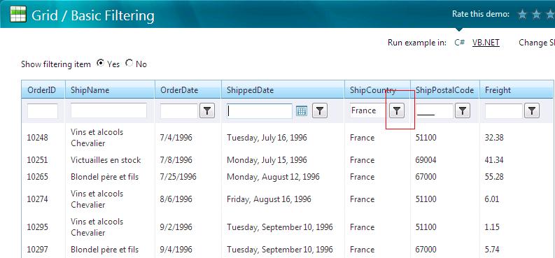
Fig. 1 – Examples of classical filtering tools
Too many actions for too tiny place. The table header becomes overcrowded easily, the readability of the content drops down. Is there a way out?
Yes, there is — if we start with answering the first and most important question an UX designer should always start with. Who will be the user and what is the typical scenario for them to use the grid? Are we talking about an application, where intense usage of the grid manipulation tools is expected? Are we sure the user needs to sort, filter and reorganize the table all the time, back and forth? Are we? In such case, these inline header tools are handy. We should not only use them, we should improve them and emphasize them and make them the hero of the grid. If the precondition is correct, these tools are to be the main controls for the user to interact with the data, with the page, with the application.
Do they really need a power-plant-like control panel?
Nevertheless, maybe we learn this precondition doesn't match our target group very often. Most of my projects within last years have displayed the same pattern: yes, users need to browse large data grids (tables, reports, logs). Yes, they are not satisfied with one, default view, they need to switch between more views of the data. But, do they need infinite possibilities of views? Do they want to play pinball with their data? No. What they really need is a well prepared, small set of views (and a tool to adjust it ocassionally).
Usually, users needed presets. Plus, an unobtrusive editor to adjust them, add, delete and organize the presets. It's like a TV set: people prefer to browse through predefined channels instead of manually scan all possible frequencies — that's too geeky approach. Anyway, if the presets are defined well and smart, most of the users are satisfied with them, and they never need an editor at all. Of course, the editor should be there just in case, but it doesn't need to be available instantly, we can hide it somewhere deeper in the menu.
But how to do it? There are so many options…

Fig. 2 – A grid example (data source Wikipedia.com)
Grid Preset Filtering (GPF)
This is the filters model I used and improved during last years, as the less obtrusive yet most versatile solution. GPF provides both required values for the user: the UI is as simple as possible until the user is satisfied with available presets — and it provides a powerful tool if the presets need to be edited.
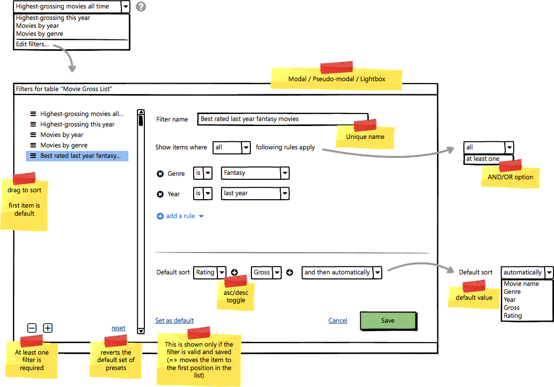
It consists of two parts. First, the preset menu is just a simple dropdown menu (or another type of suitable control) to pick one of existing view/filter presets. It's easy to use, unobtrusive, comprehensible simple control. With a smart set of available presets, this is powerful enough tool to browse the grid data upside down inside out. Even your kids can do that by one or two clicks, and it will satisfy 90 % of our users, most of the time.
The tooltip, or even the info icon with modal/lightbox on click are just optional, but they seem to be a good practice to easily explain the function of the active filter, while providing links to the editor simultaneously. Even if we omit one or both of them, at least the „Edit filters…“ item in the dropdown menu stays available for the user to enter the preset editor — the most powerful part of this multicontrol. If „edit“ or „add“ is activated, the smart preset editor is open (as modal/pseudo-modal dialog).
This is the place we can implement the most powerful filter rules we can. Typically, here we define the filtering options for all data types — „is“, „is not“, „contains“, „starts with“, „ends with“ for strings, a range from–to or list of predefined values (like „last month“, „this week“, „last 3 years“ etc.) for dates, unique picker or multiple selector for lists etc. This is completely up to our fantasy, needs and resources. The individual rules may be the same we know from the old-school, Excel-style inline filters, we can make up our own style, anything is possible here. This approach defines only the simple front-end of the control, and all the sophisticated filtering power is placed at the very end of the process. Either we decide to use as simple filtering rules as possible, or we want to apply very complex huge filtering-rule engine, everything above it stays the same. This makes this tool very versatile and universal.

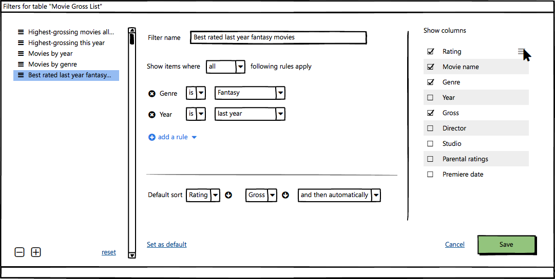
Fig. 5 – GPF editor with columns
We can also incorporate columns editor here, if we want to. In this case the presets can be even more complex, specifying what columns of the grid, in what order will be displayed in the selected view.
Once again, we have to be pretty sure our users don't need to mess with the data all the time. If they need to switch views very often, if they need to filter the data back and forth and compare them three times a minute, they need different tools. But the experience says, most of the users in most cases doesn't need that. They are typically satisfied with one default or several typical views they can easily switch among. In this case, the BPF solution seems to be simple and user-friendly, while staying robust and powerful.
Published on 22 listopadu, 2016 by pixy • Category: UX


No Comments to “Large tables filtering using presets”
Something serious to tell?
To comment, you have to login.